
< transition 1 >
전환
속성들의 값이 변경됐을 때
그 전환을 부드럽게 하는 기능
<!DOCTYPE html>
<html lang="en">
<head>
<meta charset="UTF-8" />
<meta http-equiv="X-UA-Compatible" content="IE=edge" />
<meta name="viewport" content="width=device-width, initial-scale=1.0" />
<title>Document</title>
<link rel="stylesheet" type="text/css" href="style.css" />
</head>
<body>
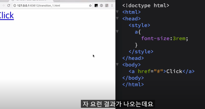
<a href="#">Click</a>
</body>
</html>a {
font-size: 3rem;
}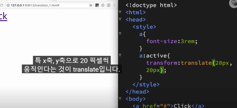
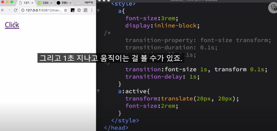
사용자가 마우스를 클릭했을 때,
효과적용 하는 방법
= active 사용

display:inline-block 을 사용해야
transform transition이 적용된다
transform 이라고 하는 속성은
a 엘리먼트가 block level 엘리먼트 이거나,
inline-block 인 경우에만 동작.
inline 엘리먼트에서는 동작 X
부자연스러운 움직임 동작을
자연스럽게 하려면
= 전환 사용
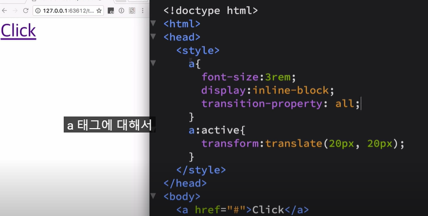
a 태그에 대해서
모든 효과에 대해서
변화가 일어났을 때
전환이 일어난다 라는 의미
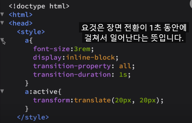
transition-duration:1s;

0.1s

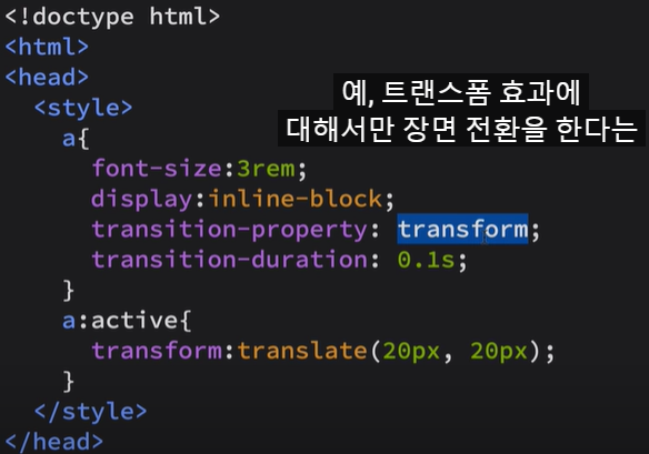
< 장면전환 효과 주기 >
all - 모든 것에 대해서
transform - 트랜스폼 효과에
대해서만 장면전환
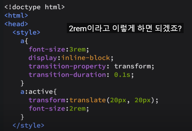

active 될 때 글씨의 크기 작게하기

복수의 장면전환 효과
지정하기
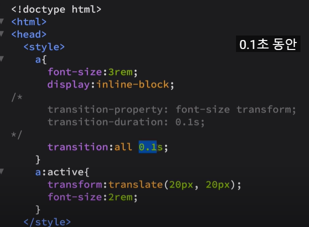
주석과 주석 아래 : 같은 효과
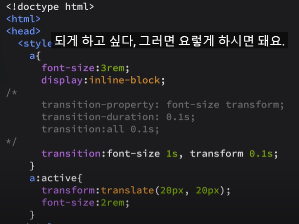
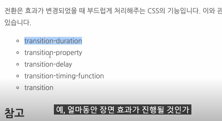
transition-duration
: 얼마동안 장면 효과가 진행될 것인가
transition-property
: 어떤 속성에 대해서 트랜지션을 할 것인가
transition-delay
: 지연시키고 싶을 때
시간을 지연시키는 효과가 있다

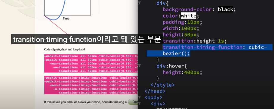
transition-timing-function
: 트랜지션이 적용될 떄 속도를
이걸 통해서 커스터마이징 가능
Ceaser - CSS Easing Animation Tool - Matthew Lein
Ceaser - CSS Easing Animation Tool - Matthew Lein
Choose an easing type and test it out with a few effects. If you don’t quite like the easing, grab a handle and fix it. When you’re happy, snag your code and off you go. Now that we can use CSS transitions in all the modern browsers, let’s make them
matthewlein.com
: 장면전환 효과를 주기 위해서 사용
기본값 - ease
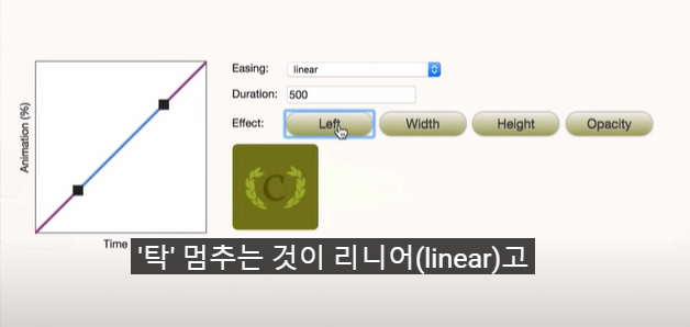
리니어: 속도가 똑같이 이동하다가
탁 멈추는 것
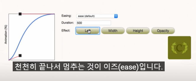
이즈: 천천히 시작해서
천천히 끝나서 멈추는 것
( 자연스러운 연출 가능 )
opacity: 도형의 color 가
변화의 속도에 따라서 바뀜
<!DOCTYPE html>
<html lang="en">
<head>
<meta charset="UTF-8" />
<meta http-equiv="X-UA-Compatible" content="IE=edge" />
<meta name="viewport" content="width=device-width, initial-scale=1.0" />
<title>Document</title>
<link rel="stylesheet" type="text/css" href="style.css" />
</head>
<body>
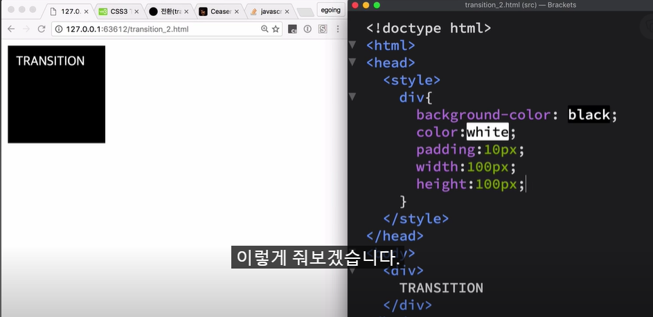
<div>TRANSITION</div>
</body>
</html>div {
background-color: black;
color: white;
padding: 10px;
width: 100px;
height: 50px;
transition: height 1s;
}
/* 마우스 올렸을 때 효과 */
div:hover {
height: 400px;
}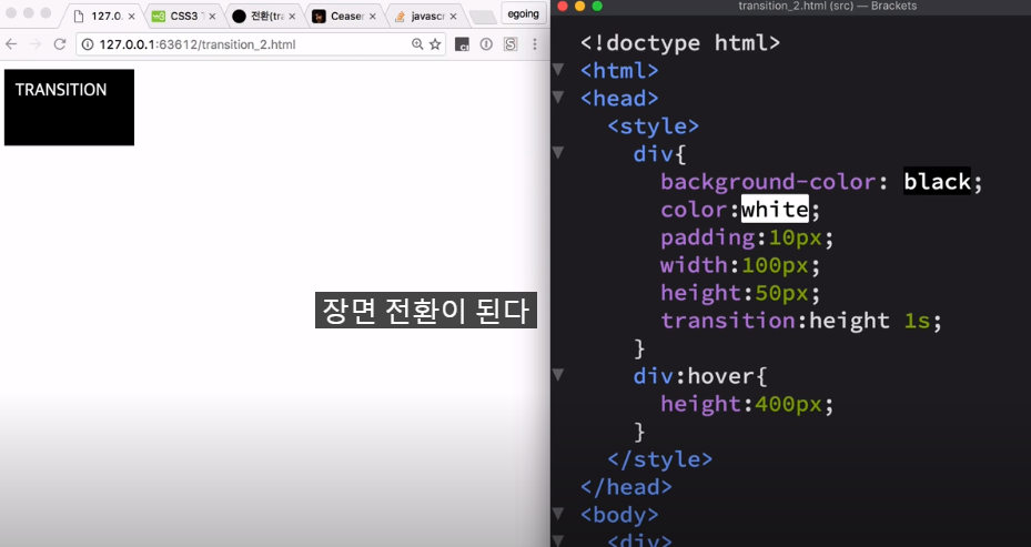
1 초 동안에 장면전환이 되는 것
transition:height 1s;
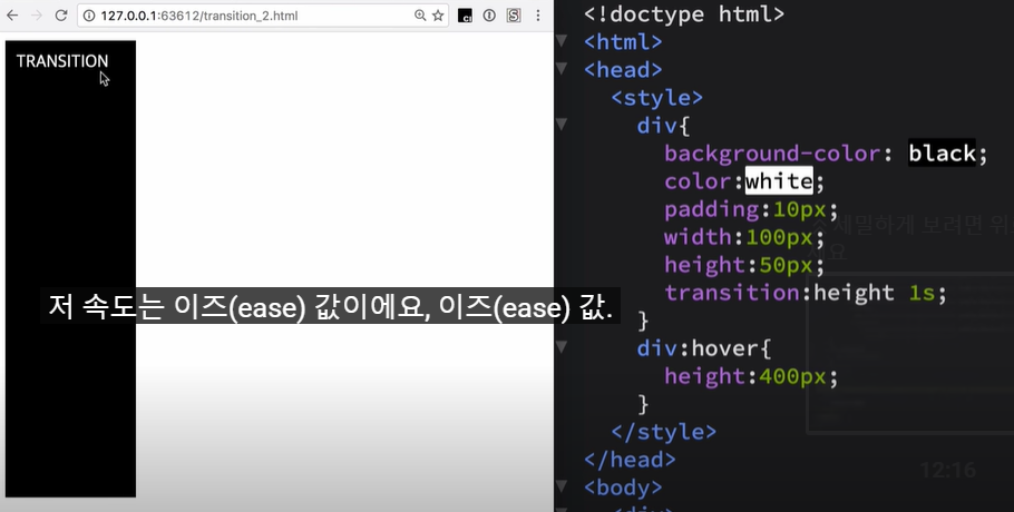
엘리먼트가 커질 때
커지는 속도 값
: ease ( 기본값 )
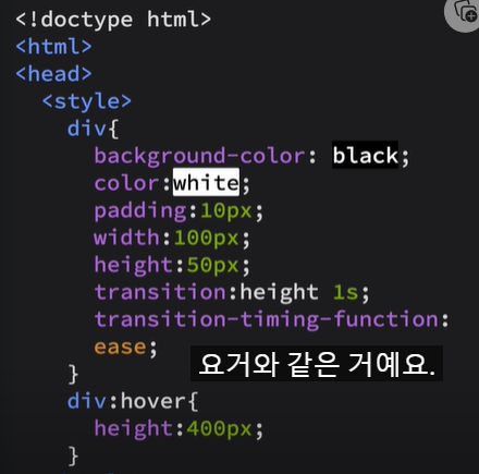
= transition-timing-function:ease;

코드 붙여넣기
7:53
'> 프로그래밍 언어 > CSS' 카테고리의 다른 글
| [생활코딩] CSS 수업 정리 (17) (0) | 2023.07.24 |
|---|---|
| [생활코딩] CSS 수업 정리 (16) (0) | 2023.07.24 |
| [생활코딩] CSS 수업 정리 (14) (0) | 2023.07.23 |
| [생활코딩] CSS 수업 정리 (13) (0) | 2023.07.23 |
| [생활코딩] CSS 수업 정리 (12) (0) | 2023.07.22 |


