728x90

[ 코딩 자율학습 ]
HTML+CSS+자바스크립트
7.1) 플렉스 박스 레이아웃으로 1차원 레이아웃 설계하기
< 플렉서블 박스 레이아웃 >
: 1차원 방식으로 효과적인 레이아웃을
설계할 수 있도록
고안된 스타일 속성
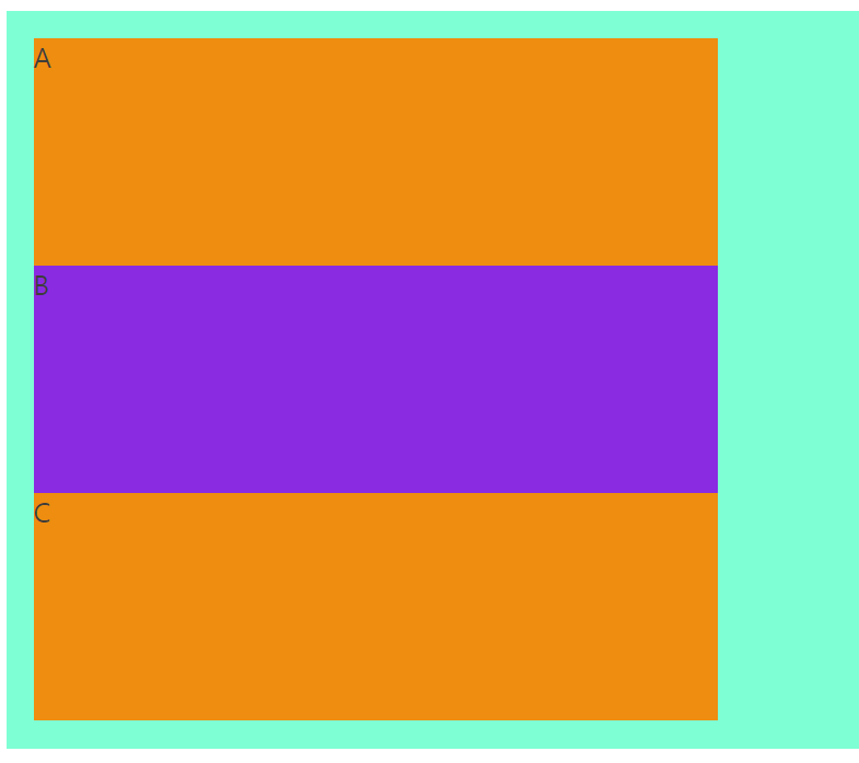
- 플렉스 박스 레이아웃 기본 속성 -
<!DOCTYPE html>
<html lang="en">
<head>
<meta charset="UTF-8" />
<meta http-equiv="X-UA-Compatible" content="IE=edge" />
<meta name="viewport" content="width=device-width, initial-scale=1.0" />
<title>Document</title>
<style>
.container {
color: rgb(63, 61, 56);
background-color: aquamarine;
padding: 1rem;
display: flex;
}
.box {
background-color: rgb(238, 141, 14);
}
.box:nth-child(2n) {
background-color: blueviolet;
}
</style>
</head>
<body>
<div class="container">
<div class="box">A</div>
<div class="box">B</div>
<div class="box">C</div>
</div>
</body>
</html>
< display 속성 >
: flex 또는 inline-flex로 지정
<!DOCTYPE html>
<html lang="en">
<head>
<meta charset="UTF-8" />
<meta http-equiv="X-UA-Compatible" content="IE=edge" />
<meta name="viewport" content="width=device-width, initial-scale=1.0" />
<title>Document</title>
<style>
.container {
color: rgb(63, 61, 56);
background-color: aquamarine;
padding: 1rem;
display: flex;
flex-direction: row-reverse;
}
.box {
background-color: rgb(238, 141, 14);
}
.box:nth-child(2n) {
background-color: blueviolet;
}
</style>
</head>
<body>
<div class="container">
<div class="box">A</div>
<div class="box">B</div>
<div class="box">C</div>
</div>
</body>
</html>
<!DOCTYPE html>
<html lang="en">
<head>
<meta charset="UTF-8" />
<meta http-equiv="X-UA-Compatible" content="IE=edge" />
<meta name="viewport" content="width=device-width, initial-scale=1.0" />
<title>Document</title>
<style>
.container {
color: rgb(63, 61, 56);
background-color: aquamarine;
padding: 1rem;
display: flex;
flex-direction: column;
}
.box {
background-color: rgb(238, 141, 14);
}
.box:nth-child(2n) {
background-color: blueviolet;
}
</style>
</head>
<body>
<div class="container">
<div class="box">A</div>
<div class="box">B</div>
<div class="box">C</div>
</div>
</body>
</html>

< flex-direction 속성 >
: 플렉스 박스 레이아웃의
주축 방향을 결정
<!DOCTYPE html>
<html lang="en">
<head>
<meta charset="UTF-8" />
<meta http-equiv="X-UA-Compatible" content="IE=edge" />
<meta name="viewport" content="width=device-width, initial-scale=1.0" />
<title>Document</title>
<style>
.container {
color: rgb(63, 61, 56);
background-color: aquamarine;
padding: 1rem;
display: flex;
flex-direction: row;
flex-flow: column nowrap;
}
.box {
width: 400px;
background-color: rgb(238, 141, 14);
}
.box:nth-child(2n) {
background-color: blueviolet;
}
</style>
</head>
<body>
<div class="container">
<div class="box">A</div>
<div class="box">B</div>
<div class="box">C</div>
</div>
</body>
</html>
< flex-wrap 속성 >
: 플렉스 컨테이너 영역을
벗어날 때 어떻게 처리할지를 결정
< flex-flow 속성 >
: flex-direction 속성과
flex-wrap 속성을 한 번에
사용할 수 있는단축 속성
<!DOCTYPE html>
<html lang="en">
<head>
<meta charset="UTF-8" />
<meta http-equiv="X-UA-Compatible" content="IE=edge" />
<meta name="viewport" content="width=device-width, initial-scale=1.0" />
<title>Document</title>
<style>
.container {
color: rgb(63, 61, 56);
background-color: aquamarine;
padding: 1rem;
display: flex;
flex-flow: row wrap;
justify-content: flex-start;
}
.box {
width: 400px;
background-color: rgb(238, 141, 14);
}
.box:nth-child(2n) {
background-color: blueviolet;
}
</style>
</head>
<body>
<div class="container">
<div class="box">A</div>
<div class="box">B</div>
<div class="box">C</div>
</div>
</body>
</html>
<!DOCTYPE html>
<html lang="en">
<head>
<meta charset="UTF-8" />
<meta http-equiv="X-UA-Compatible" content="IE=edge" />
<meta name="viewport" content="width=device-width, initial-scale=1.0" />
<title>Document</title>
<style>
.container {
color: rgb(63, 61, 56);
background-color: aquamarine;
padding: 1rem;
display: flex;
flex-flow: row wrap;
justify-content: center;
}
.box {
width: 400px;
background-color: rgb(238, 141, 14);
}
.box:nth-child(2n) {
background-color: blueviolet;
}
</style>
</head>
<body>
<div class="container">
<div class="box">A</div>
<div class="box">B</div>
<div class="box">C</div>
</div>
</body>
</html>
< justify-content 속성 >
: 아이템을 주축 방향으로 정렬할 때 사용
<!DOCTYPE html>
<html lang="en">
<head>
<meta charset="UTF-8" />
<meta http-equiv="X-UA-Compatible" content="IE=edge" />
<meta name="viewport" content="width=device-width, initial-scale=1.0" />
<title>Document</title>
<style>
.container {
color: rgb(63, 61, 56);
background-color: aquamarine;
padding: 1rem;
height: 400px;
display: flex;
flex-flow: row wrap;
align-items: stretch;
}
.box {
width: 400px;
background-color: rgb(238, 141, 14);
}
.box:nth-child(2n) {
background-color: blueviolet;
}
</style>
</head>
<body>
<div class="container">
<div class="box">A</div>
<div class="box">B</div>
<div class="box">C</div>
</div>
</body>
</html>
< align-items 속성 >
: 아이템을 교차축 방향으로 정렬할 때 사용
7.2) 그리드 레이아웃으로 2차원 레이아웃 설계하기
<!DOCTYPE html>
<html lang="en">
<head>
<meta charset="UTF-8" />
<meta http-equiv="X-UA-Compatible" content="IE=edge" />
<meta name="viewport" content="width=device-width, initial-scale=1.0" />
<title>Document</title>
<style>
.container {
color: rgb(63, 61, 56);
background-color: aquamarine;
padding: 1rem;
height: 400px;
display: grid;
}
.box {
width: 400px;
background-color: rgb(238, 141, 14);
}
.box:nth-child(2n) {
background-color: blueviolet;
}
</style>
</head>
<body>
<div class="container">
<div class="box">A</div>
<div class="box">B</div>
<div class="box">C</div>
<div class="box">D</div>
</div>
</body>
</html>
< 그리드 레이아웃 속성 >
: 2차원 방식으로 레이아웃 설계할 수 있도록
고안된 스타일 속성
<!DOCTYPE html>
<html lang="en">
<head>
<meta charset="UTF-8" />
<meta http-equiv="X-UA-Compatible" content="IE=edge" />
<meta name="viewport" content="width=device-width, initial-scale=1.0" />
<title>Document</title>
<style>
.container {
color: rgb(63, 61, 56);
background-color: aquamarine;
padding: 1rem;
height: 400px;
display: grid;
grid-template-columns: repeat(2, minmax(100px, 1fr));
grid-template-rows: repeat(2, minmax(100px, 1fr));
row-gap: 1rem;
column-gap: 1rem;
}
.box {
width: 400px;
background-color: rgb(238, 141, 14);
}
.box:nth-child(2n) {
background-color: blueviolet;
}
</style>
</head>
<body>
<div class="container">
<div class="box">A</div>
<div class="box">B</div>
<div class="box">C</div>
<div class="box">D</div>
</div>
</body>
</html>
< row-gap과 column-gap 속성 >
: row-gap = 행과 행사이의 간격 지정
column-gap = 열과 열 사이의 간격 지정
7.3) 반응형 웹을 위한 미디어 쿼리 사용하기
뷰포트
: 웹페이지가 보이는 화면 영역
<!DOCTYPE html>
<html lang="en">
<head>
<meta charset="UTF-8" />
<meta http-equiv="X-UA-Compatible" content="IE=edge" />
<meta name="viewport" content="width=device-width, initial-scale=1.0" />
<title>반응형 웹을 위한 미디어 쿼리 사용하기</title>
<style>
@media only screen and (min-width: 1140px) {
p {
color: blue;
}
}
</style>
</head>
<body>
<p>
Lorem ipsum dolor sit amet consectetur adipisicing elit. Dolorem deserunt
blanditiis, ab soluta accusantium rerum unde quisquam aliquam quaerat,
fugit sit quia aspernatur adipisci aliquid asperiores. Ut id alias minima
</p>
</body>
</html>
< 미디어 쿼리 기본 문법 >
: 항상 @media 문법으로 시작
<!DOCTYPE html>
<html lang="en">
<head>
<meta charset="UTF-8" />
<meta http-equiv="X-UA-Compatible" content="IE=edge" />
<meta name="viewport" content="width=device-width, initial-scale=1.0" />
<title>반응형 웹을 위한 미디어 쿼리 사용하기</title>
<style>
@media only screen and (min-width: 340px) and (orientation: portrait) {
p {
color: blue;
}
}
</style>
</head>
<body>
<p>
Lorem ipsum dolor sit amet consectetur adipisicing elit. Dolorem deserunt
blanditiis, ab soluta accusantium rerum unde quisquam aliquam quaerat,
fugit sit quia aspernatur adipisci aliquid asperiores. Ut id alias minima
</p>
</body>
</html>
- 미디어 조건 예시 -
portrait
: 화면의 방향이 세로일 때만 적용
<!DOCTYPE html>
<html lang="en">
<head>
<meta charset="UTF-8" />
<meta http-equiv="X-UA-Compatible" content="IE=edge" />
<meta name="viewport" content="width=device-width, initial-scale=1.0" />
<title>반응형 웹을 위한 미디어 쿼리 사용하기</title>
<style>
@media only screen and (min-width: 640px) {
p {
color: blue;
}
}
@media only screen and (min-width: 440px) {
p {
color: red;
}
}
</style>
</head>
<body>
<p>
Lorem ipsum dolor sit amet consectetur adipisicing elit. Dolorem deserunt
blanditiis, ab soluta accusantium rerum unde quisquam aliquam quaerat,
fugit sit quia aspernatur adipisci aliquid asperiores. Ut id alias minima
</p>
</body>
</html>
max-width
: 650보다 작으면
스타일이 적용
그리고 중첩 사용도 가능
728x90
'> 학습단 > 코딩 자율학습단 2기' 카테고리의 다른 글
| [ HTML + CSS + 자바스크립트] 9.3 (2) | 2023.04.02 |
|---|---|
| [ HTML + CSS + 자바스크립트] 8.1 ~ 9.2 (0) | 2023.04.02 |
| [ HTML + CSS + 자바스크립트] 6.7 ~ 6.9 (0) | 2023.04.02 |
| [ HTML + CSS + 자바스크립트] 6.5 ~ 6.6 (0) | 2023.04.02 |
| [ HTML + CSS + 자바스크립트] 6.3 ~ 6.4 (0) | 2023.04.02 |


